By Scott Smith
November 2, 2021
Our design process is grounded in strategic ideas that form the basis for a visual narrative. Whether we’re designing a brand or a slide deck, our general approach is the same:
- Start with ideas, tone, and communications goals that we’re trying to get across. The client wants to say something. It could be a strategic message or communicating brand values, a campaign concept, personality traits, or all of the above. Our process begins with facilitating a discussion to establish the concept and tone of voice.
- Think about the audience. Who is the target for what we’re creating? How can we meet them where they are? Are they receptive? Skeptical? Indifferent? What notions or needs do they have as we engage with them?
These inputs culminate in a Design Strategy, which directs the design work in our Visual Direction phase.
- Design a visual concept that artfully and credibly conveys the ideas. We explore visual ideas and then hone the one that perfectly balances the various ideas.
A great example of this process can be seen in the 2020 Annual Report design for the Oregon Community Foundation (OCF). We’ve worked with OCF for many years, starting with a complete rebrand (strategy, visual identity, collateral) and design and development of their website, and they came to us earlier this year to help conceptualize and design their annual report.
A community foundation is an interesting type of organization. Unlike a private foundation, which are often endowed by a single person or family, their endowment comes from individual donors.
As soon as the pandemic hit, OCF, like all foundations, saw the need for funding skyrocket. And after George Floyd’s murder, there was a great outcry for more funding for social justice efforts. The moment called for action on a massive scale… and quickly. As you will see in the Annual Report, OCF immediately got to work deploying their resources all across Oregon. They partnered with other institutions around the state to set up vehicles for dispersing funds and bring Oregonians together to fund them. It was a year of incredible anguish that was met with incredible generosity.
For the report design, we worked closely with OCF’s communication and program teams to develop the overarching story and explore ideas for how this report could stand out as a call to action to continue the work of supporting Oregonians. At this stage, our job is to help the client articulate key communication goals that could be the foundations of a visual narrative. OCF wanted the annual report to focus on the donors and the communities they serve, not on themselves. They wanted to clearly acknowledge the pain so many experienced, but also of the bright light of the generous actions of so many.
We wrote four experience goals that would guide the design work and help us develop a visual narrative:
- The idea of a contrast between difficulty and hope.
- The idea of a massively complex effort, told with elegance and gravity.
- The idea of some element that connects the contrasting elements.
- The focus had to be on people, on the community, which meant that photography was crucial.
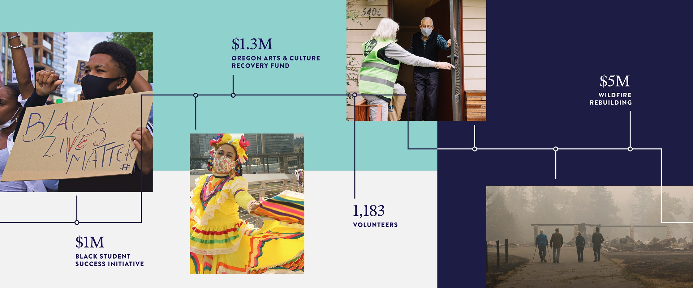
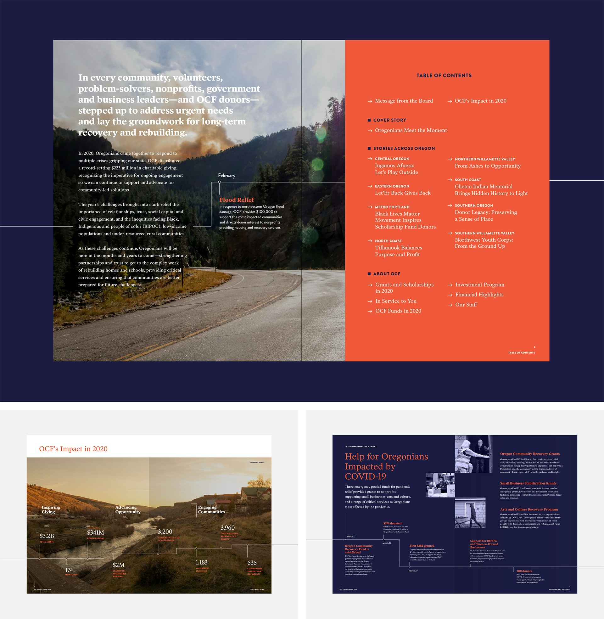
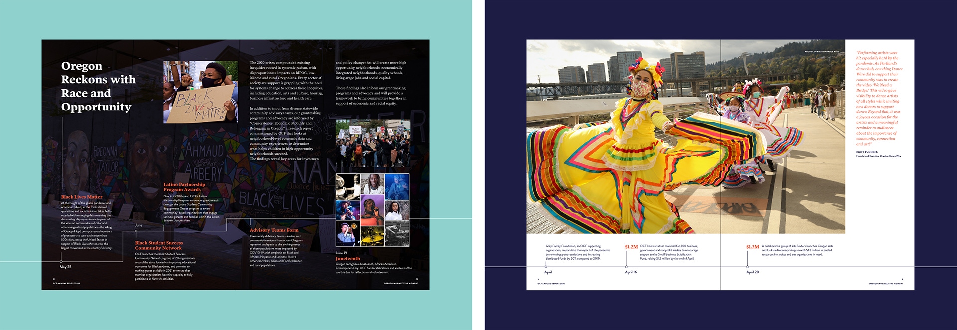
The trick was to find a design that was relevant to all of these goals. We came up with many explorations but hit on an idea of a line that could be continuous throughout the report to represent a timeline as well as connectivity. There were so many parts to this story, so many issues, so many regions, but all one state, one story, one great big community. This line could tie the story together and pull people through the book.
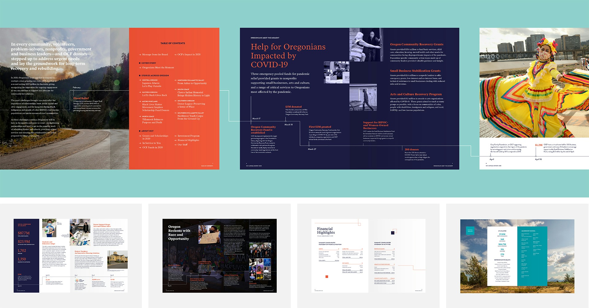
Inside the book, the line became several things, including a scaffold to tell a sequence of events. At times, you'll see the line packed with events and stats to dramatize how much effort was mounted in such a short time.
Contrast of light and dark
The other idea, which was quite literal, was alternating between dark and light pages, between difficult images and hopeful images, to show that OCF is not shying away from the tough parts of our experience and sugarcoating it. The tough parts are the point. That’s why the organization exists.
Smith & Connors’ design talent stands out in our 2020 Annual Report. They capture the urgency and challenge of the moment, emphasize Oregonian humanity in delivering important work, and strike just the right balance of gravitas and hope as we look to a future of working together to address thorny, entrenched issues facing our state.
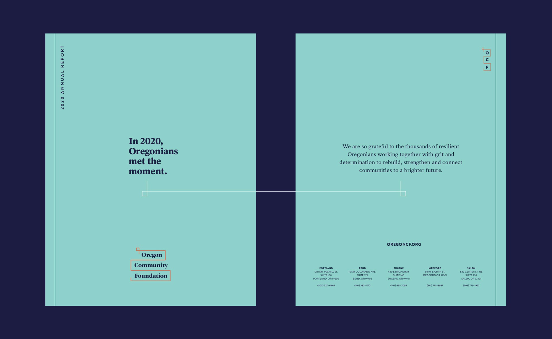
Simplicity with a note of gravitas
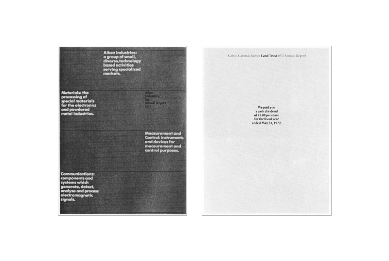
We had the idea for a bold, simple cover that starts the story and pulls the reader inside. Simple, very different from their previous reports, and intriguing. But the story is all about people, so shouldn’t we show people on the cover? Should we do a collage, or one large image? But it just wasn’t enough to do it the same old way for the most anomalous year that was 2020. So, how could we acknowledge the donors and show gratitude for this community? We took inspiration from classic annual reports from the 1950s that used imagery and space to focus the mood and story.
OCF knew they wanted the story to be about how “Oregonians met the moment”. So we put our concepts together and started the first line of the first story on the cover. The cover is solemn, hopeful, simple, and pulls people in to find out just how the people of our great state met 2020.
The line would continue through the book, and end on the back cover with a statement of gratitude.
It’s tempting to just jump into design without establishing that key visual narrative, but we’ve found that it’s an essential process that always pays off.