Sector
Services
Link
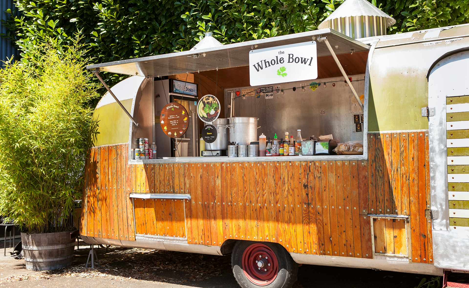
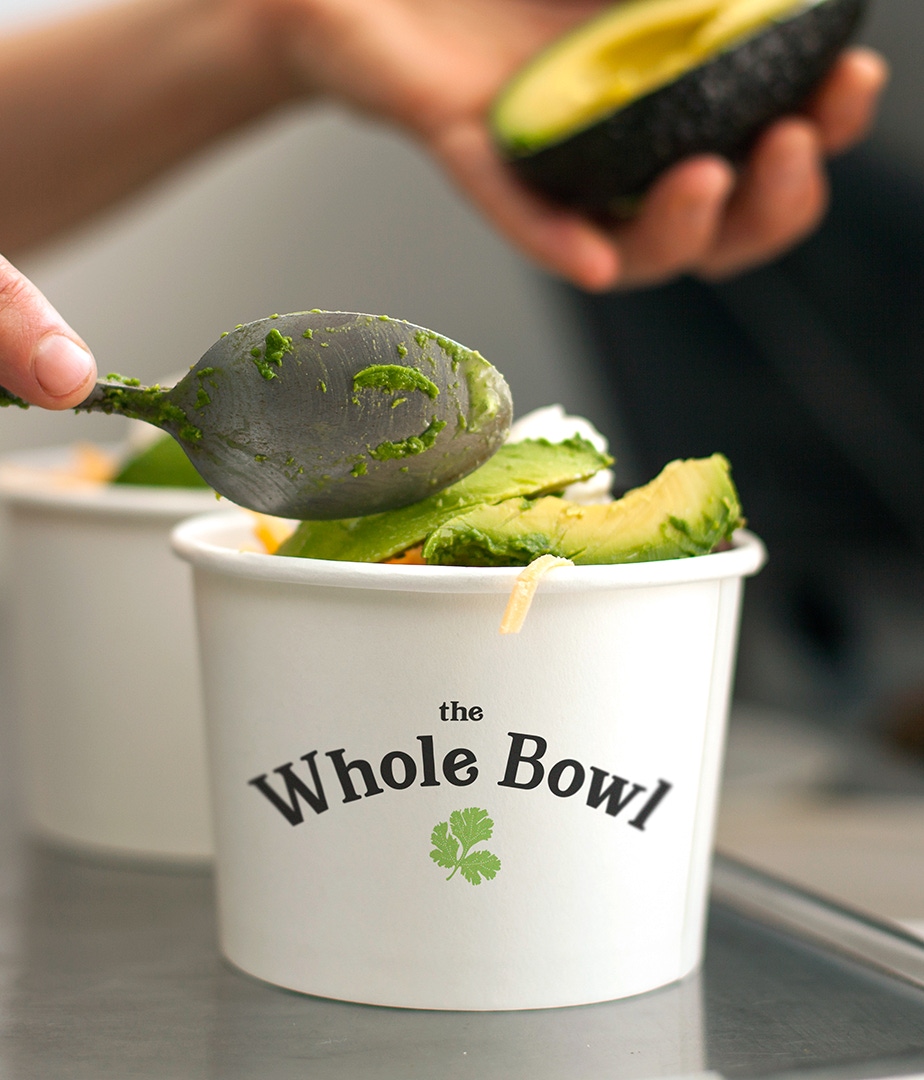
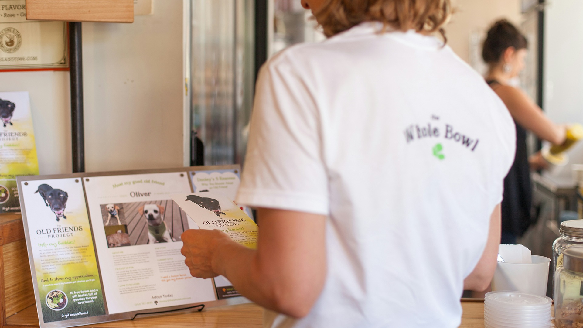
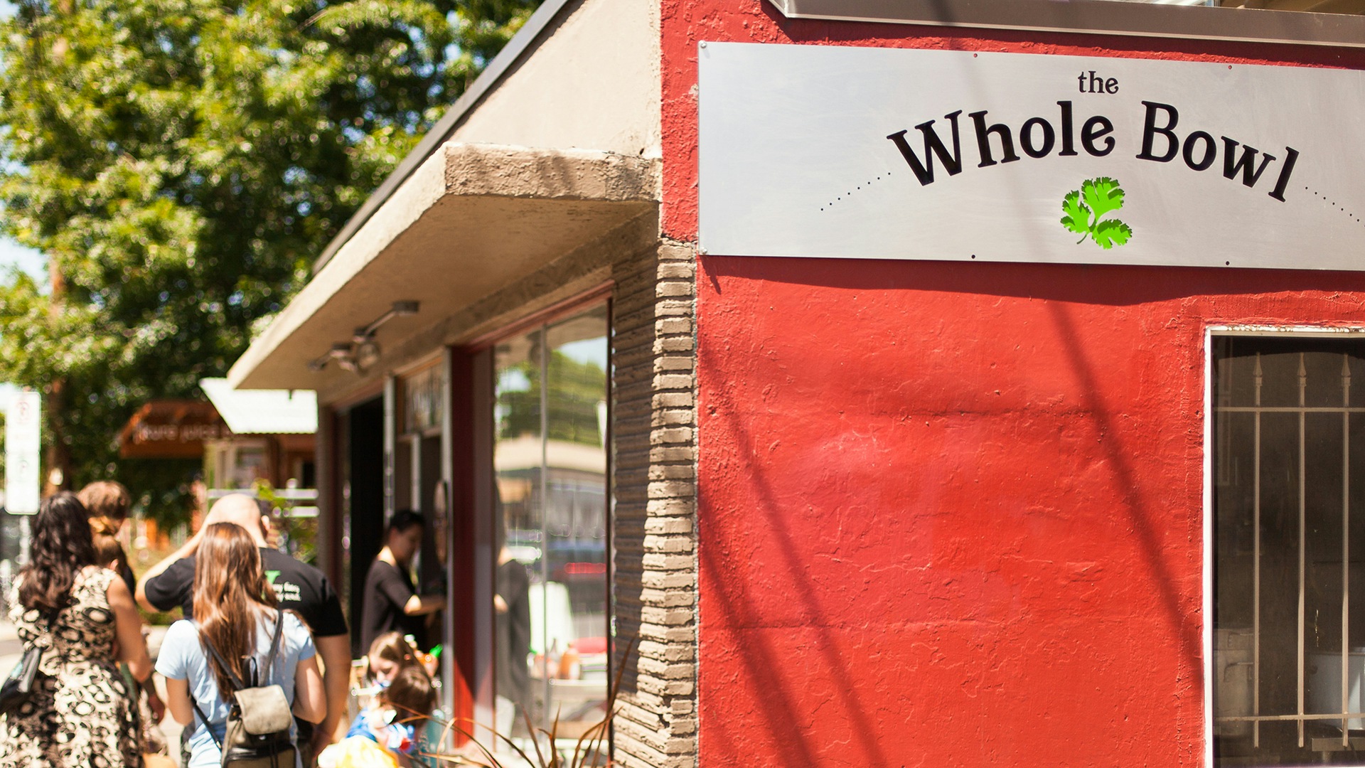
The Whole Bowl was one of the very first food carts to establish roots in Portland. When owner Tali Ovadia was about to open her fifth flagship location, she was looking for a more flexible, inspiring, and unified brand identity.
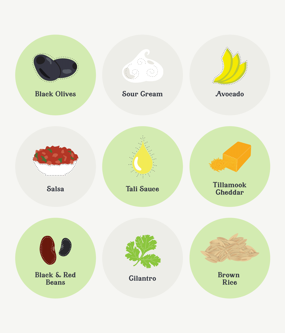
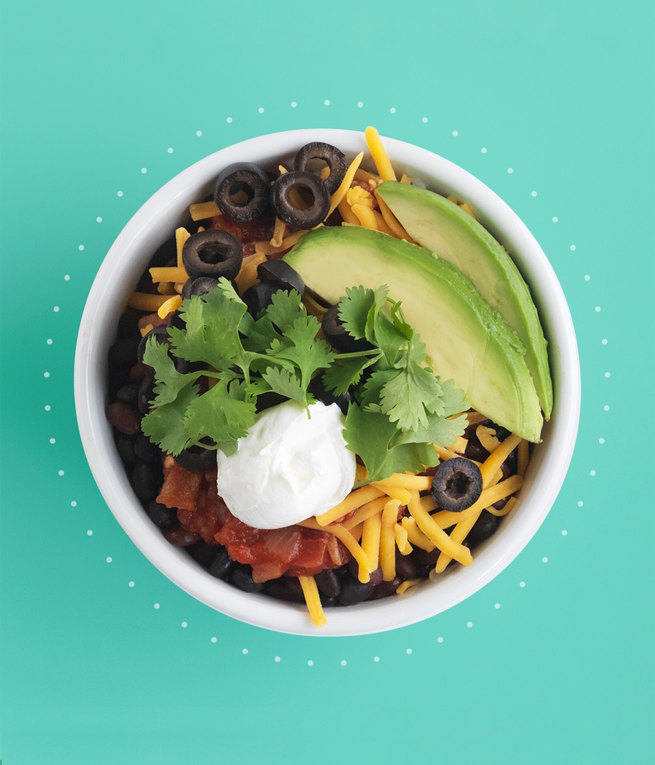
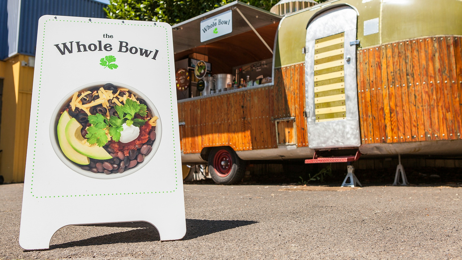
The Whole Bowl sells one product: nine healthy, delicious ingredients topped with a top-secret umami-packed sauce. Tali built the business by doing almost everything by herself, including recruiting her friends to hand-draw the eclectic illustrations and signage. It was charming, but as popularity grew for her Bowls and she felt the pull to expand across Portland and nationally, she needed a new brand identity that could honor its roots while adding polish and punch.
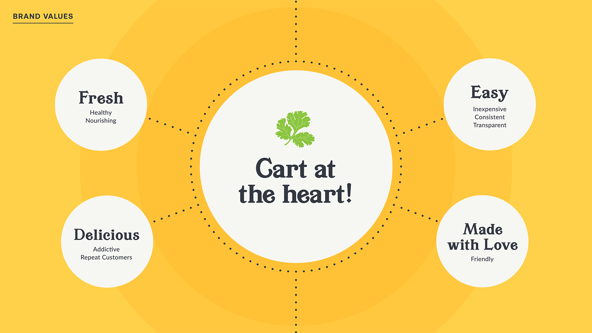
A Brand Platform for Expansion
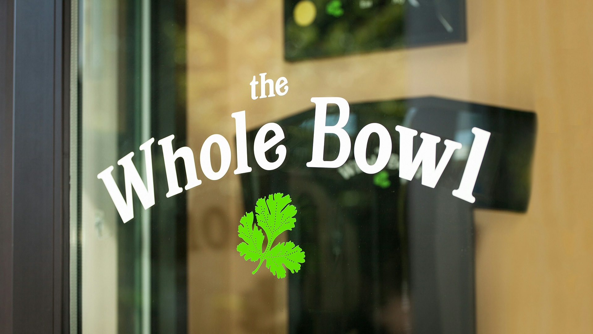
Built to expand, still rooted in beloved originality
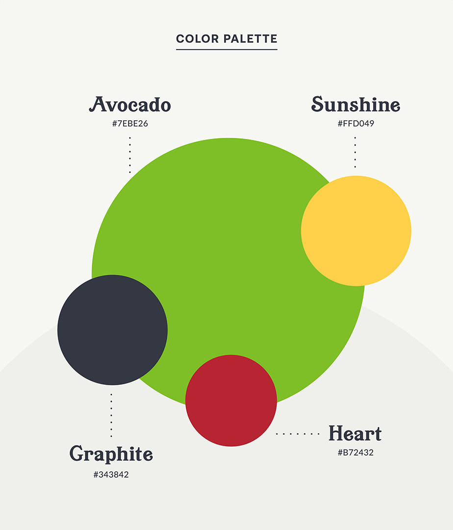
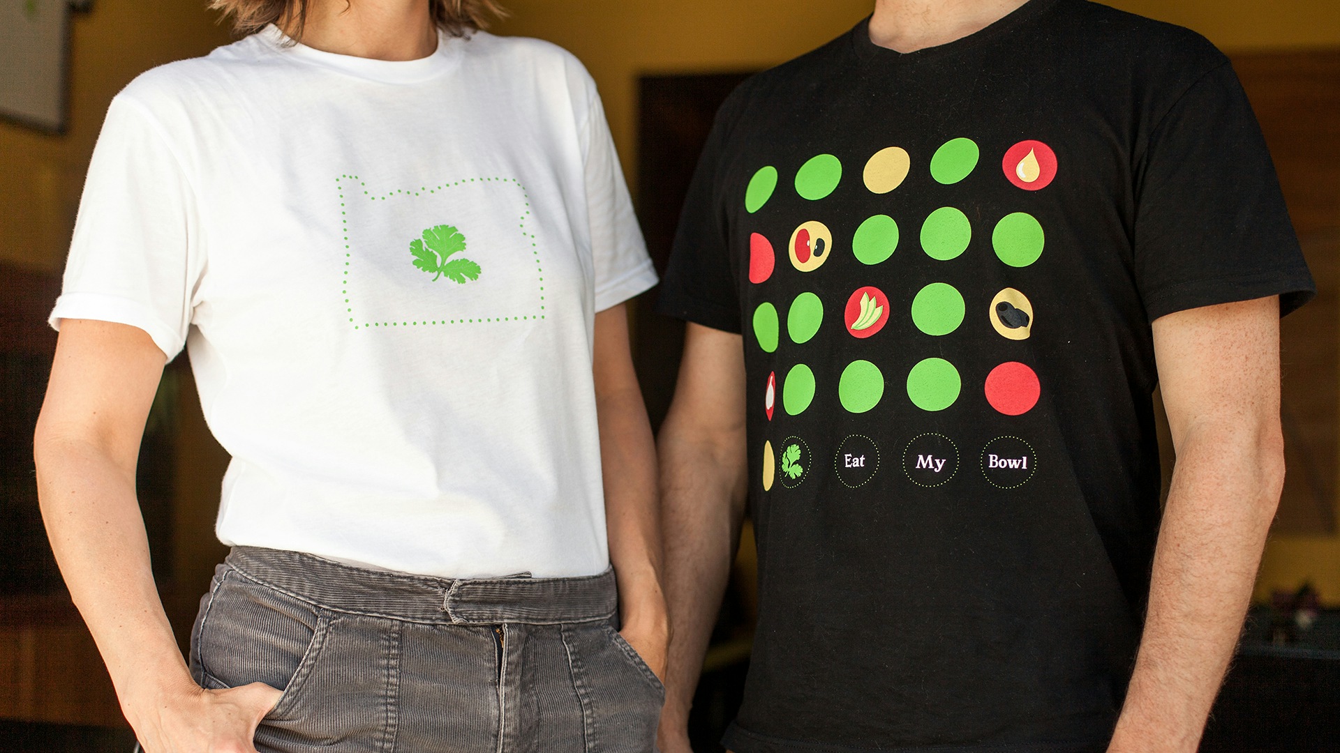
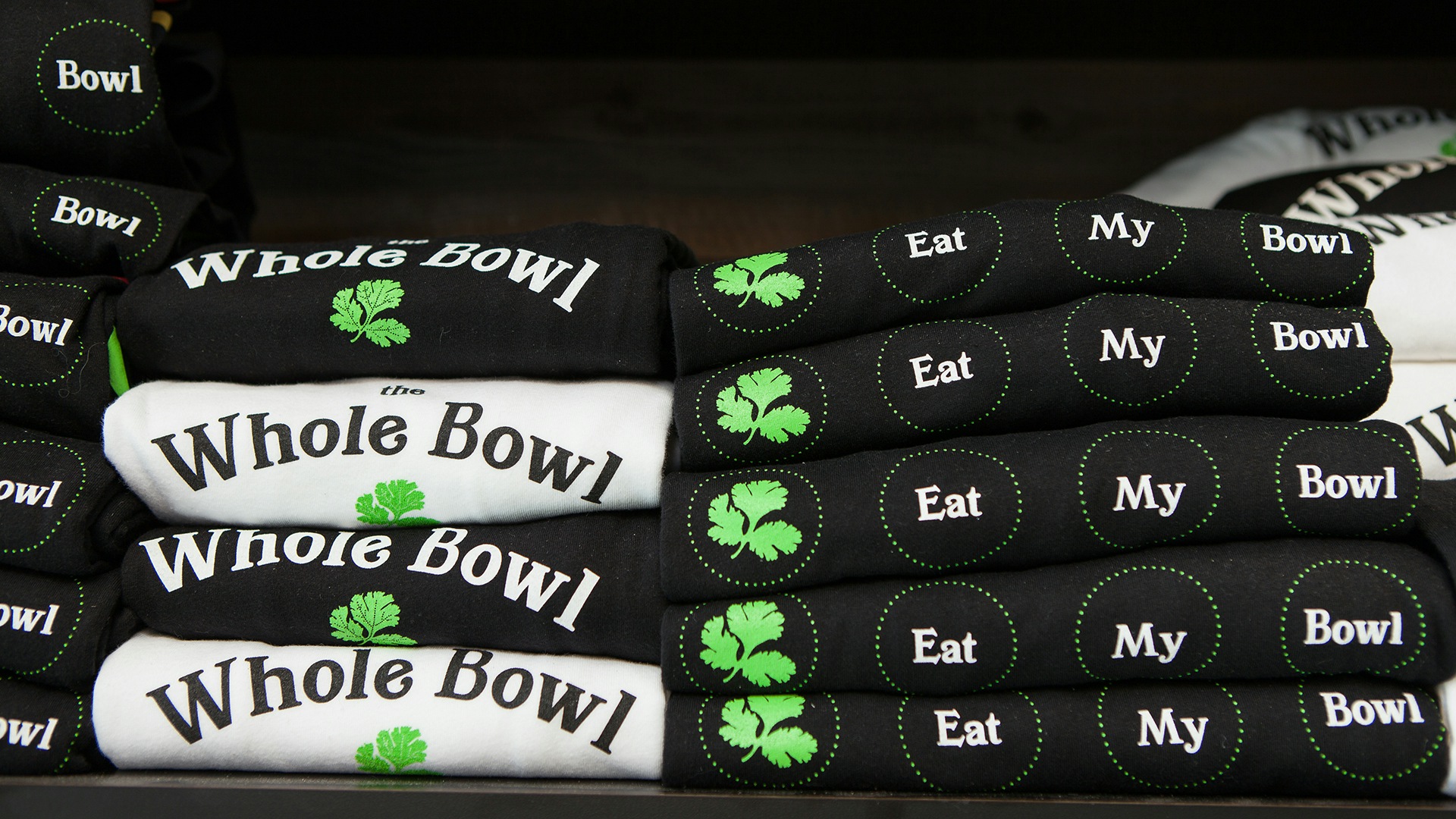
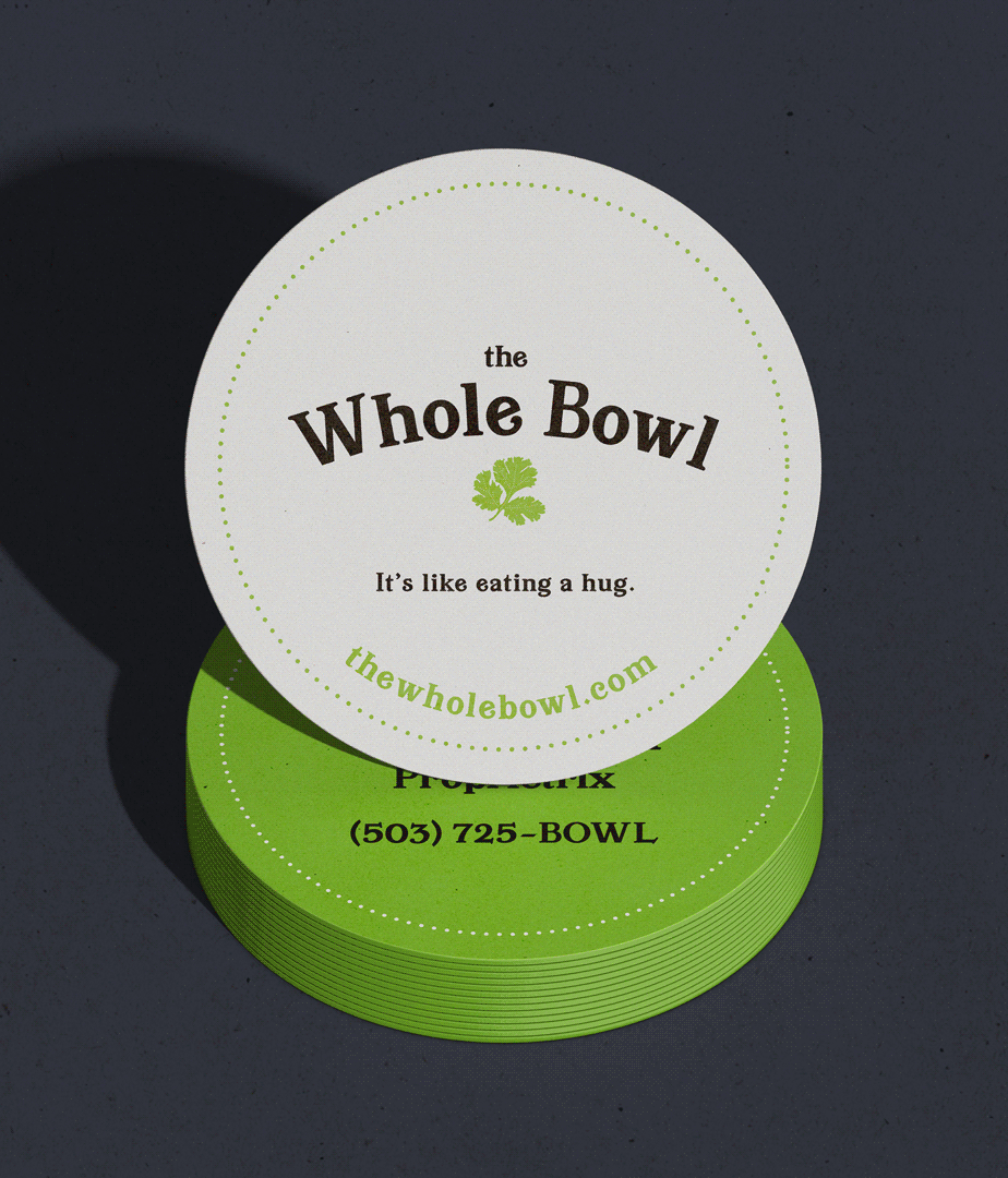
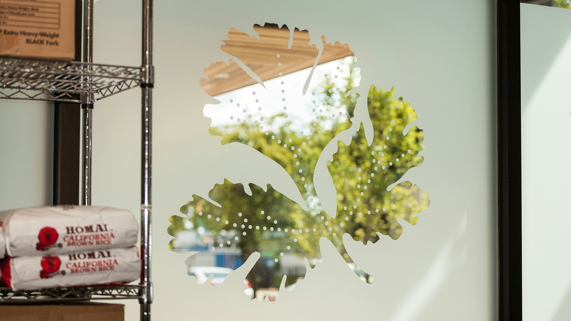
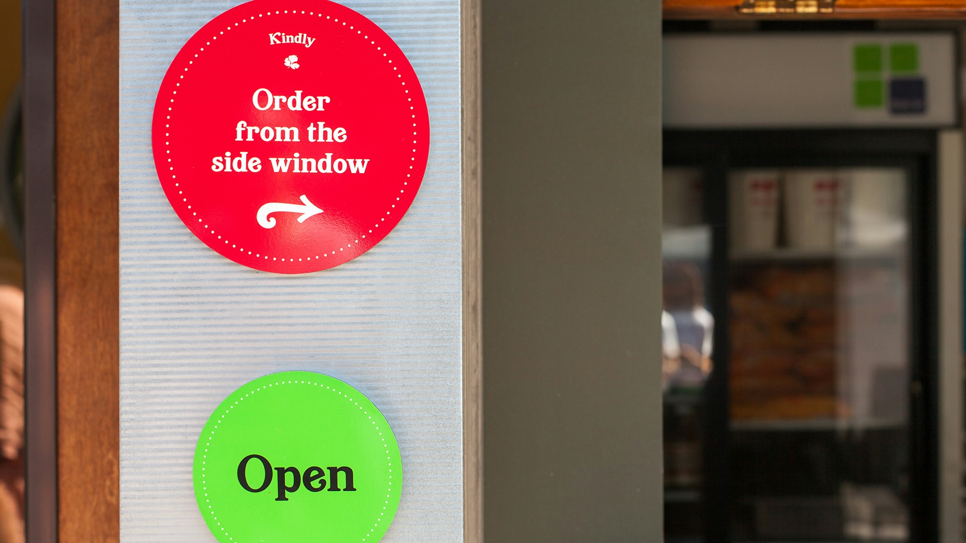
The Whole Bowl logo would soon appear in dozens of food carts and restaurants across Oregon. We developed a brand system that would express their wholesome roots across signage systems, marketing, swag, packaging, staff uniforms, and more. A motif of brightly-colored dots expresses the delightful experience of grabbing a Bowl.
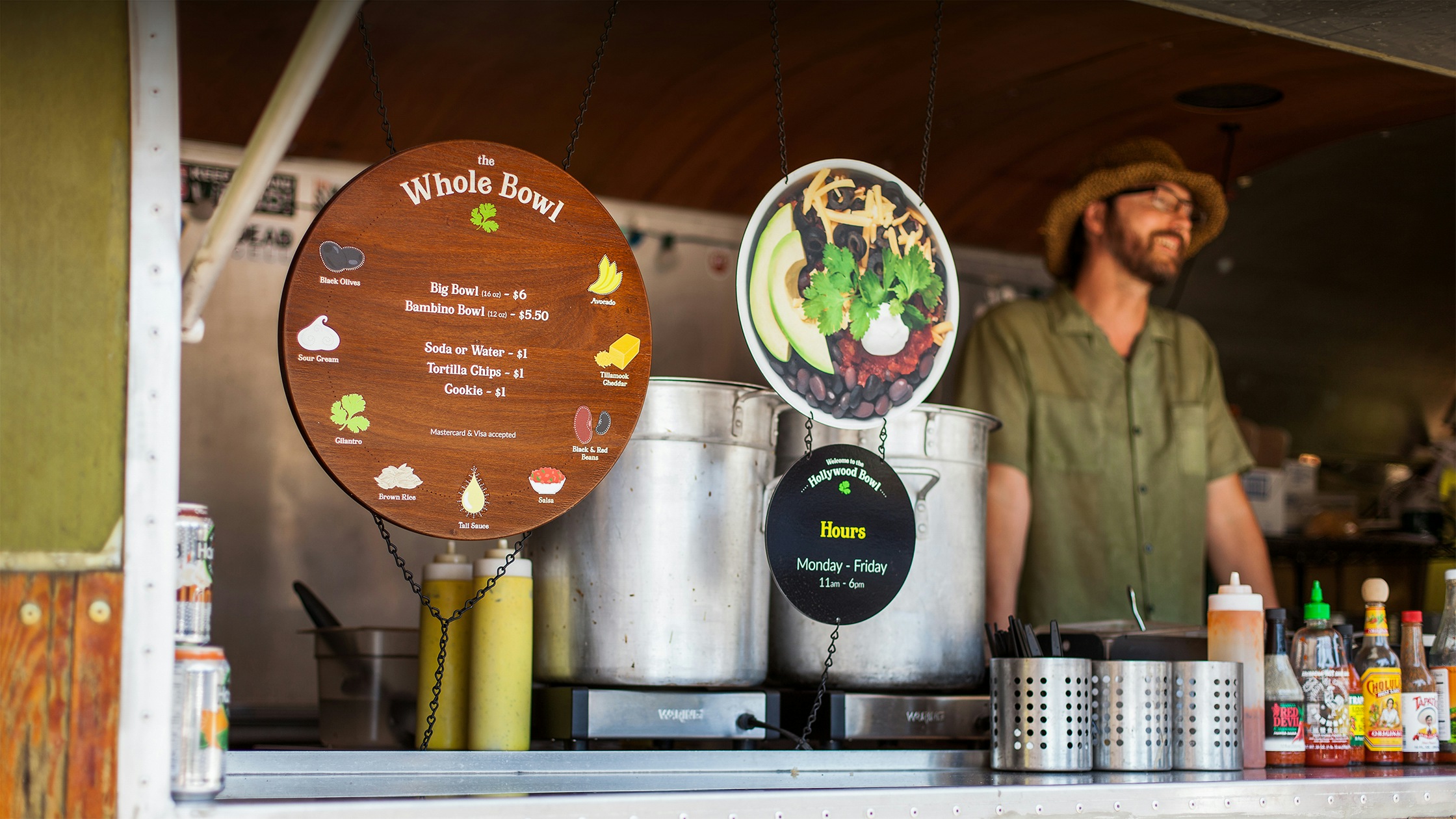
It’s a good sign
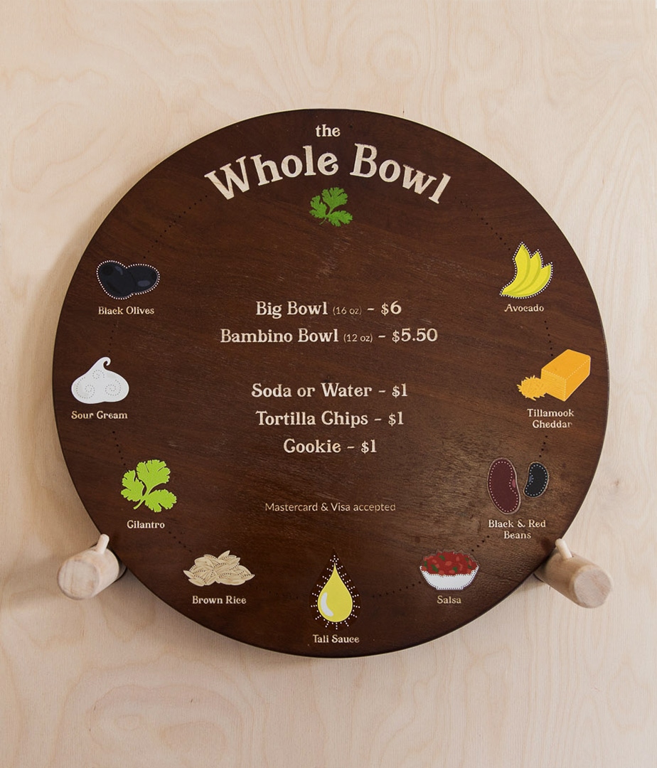
One of the coolest and most fun brand applications we developed is the menu board. It's fabricated out of wood, laser engraved, and then painted with a simple brand palette. The menu itself communicates the handmade feel of the food and the brand tagline of “It’s Like Eating a Hug!” Wood and steel signs use fundamental materials that tell the whole story of The Whole Bowl.
As a businesswoman who has worked with many vendors, working with Smith & Connors has been a pleasure cruise with professional results that made me grateful to have found them.

Project Scope
- Brand Guidelines
- Brand Strategy & Messaging
- Logo Design
- Positioning
- Print & Collateral Design
- Signage & Environmental Design
- Visual Identity Systems
- Photography Direction